Home page sections
Revolution slider
How to manage revolution slider (basic)How to manage revolution slider (advanced)
Options
| # | Option | Description |
| 1 | Change slides every (seconds) | Set timeout in seconds for next slide |
| 2 | Navigation style |
Choose style of arrow and bullets. Options: Style 1 - arrows: bottom right, bullets: bottom right Style 2 - arrows: left/right center, bullets: bottom center Style 3 - arrows: left/right center, bullets: off Style 4 - arrows: right center, bullets: right center (vertical) Off - arrows: off, bullets: off |
Blocks
| # | Name | Description |
| 1 | Slide (image) | Add image slide. |
| 2 | Slide (video) | Add video slide. |
| 3 | Advanced options | Add this block if you need advanced configuration of slider navigation: arrows and bullets. |
Slide (image) block's options
| # | Block option | Description |
| 1 | Image | Upload slide image |
| 2 | Slide style |
Select slide animation type Options: Style 1 - slide from bottom to top Style 2 - zoom out effect Style 3 - slide from right to left Style 4 - zoom out effect (and stop at the end) Style 5 - slide from top to bottom Off - default style |
| 3 | Show info? | Show/hide text info layer. |
| 4 | URL | Slide URL (works when product not selected) |
| 5 | Product | Select product for text info and slider link |
| 6 | Button Icon (icon code) | Set button icon. Leave empty to remove button. |
| 7 | Line 1 (text) | Set info text line #1. (works when product not selected) |
| 8 | Line 2 (text) | Set info text line #2. (works when product not selected) |
| 9 | Line 3 (small text) | Set info text line #3. (works when product not selected) |
| 10 | Info position horizontal | Configure text info position |
| 11 | Info position vertical | Configure text info position |
| 12 | Info offset horizontal | Set horizontal offset for info text block (in pixels) |
| 13 | Info offset vertical | Set vertical offset for info text block (in pixels) |
| 14 | Info move on hover | Set how far move text on hover |
| 15 | Colors | Set colors |
| 16 | Use custom HTML? | Enable/disable custom HTML for text info block |
| 17 | Content info | Text info block content |
| 18 | Params slide | Advanced users only. Set custom attributes for slide. Check Revolution's slider documentation for more details. |
| 19 | Params image | Advanced users only. Set custom attributes for image. Check Revolution's slider documentation for more details. |
| 20 | Params Info | Advanced users only. Set custom attributes for text info layer. Check Revolution's slider documentation for more details. |
Slide (video) block's options
| # | Name | Description |
| 1 | Video type | Select video type. MP4 self hosted. Video service hosted (YourTube or Vimeo) |
| 2 | Video URL | Upload video file at Store admin -> Online Store -> Files |
| 3 | YourTube or Vimeo URL | YourTube or Vimeo video URL |
Advanced options block's options
| # | Name | Description |
| 1 | Show bullets? | Show/hide bullets |
| 2 | Show arrows? | Show/hide arrows |
| 3 | Navigation direction | Select navigation directions |
| 4 |
Bullets position horizontal Bullets position vertical Bullets offset horizontal Bullets offset vertical |
Bullets position options. Set bullets offset in pixels. |
| 5 |
Left arrow position horizontal Left arrow position vertical Left arrow offset horizontal Left arrow offset vertical |
Left arrow position options. Set left arrow offset in pixels. |
| 6 |
Right arrow position horizontal Right arrow position vertical Right arrow offset horizontal Right arrow offset vertical |
Right arrow position options. Set right arrow offset in pixels. |
Scroll slider (vertical slider)
Slider with unique vertical-scroll animation.
Slide's options is the same as for Revolution slide. Please read information about Revolution slider to get the idea how to manage slides.
Scroll slider doesn't support video slide.
Scroll slider doesn't support advanced navigation options.
Banners configuration, advanced (12:44)
Banners
Use this section to manage banners at home page.
Section options
| # | Name | Description |
| 1 | Width | Change section width. Available options: boxed, fullwidth. |
| 2 | Banners per row | Set number of banners per row. Available options: 2, 3, 4. This option works only on wide screens. |
| 3 | Margin |
Set section margin. Margin will be applied to container of all items. Available options: None - 0 margin 100px auto 90px (demo2) - set margin-top to 100px, set margin-bottom to 90px, set margin-left and margin-right to auto (it means center in the screen). This values is the same as on demo#2. Custom - set custom margin in next field. You should be familiar with CSS margin property. |
| 4 | Custom margin |
This is pure CSS field. You can put any valid CSS value here. Get more info here |
| 5 | Padding (grid inner) |
Set item padding. Padding will be applied per each item inside container. Available options: None - 0 padding 0 12px 0 12px (demo2) - set padding-top to 0px, set margin-left to 12px, set padding-bottom to 0px, set padding-right to 12px . This values is the same as on demo#2. Custom - set custom padding in next field. You should be familiar with CSS padding property. |
| 6 | Custom padding |
This is pure CSS field. You can put any valid CSS value here. Get more info here |
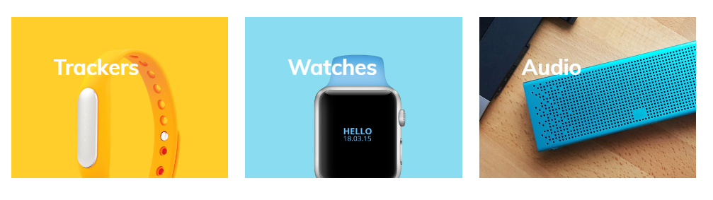
| 7 | Block: Banner | Add as many banners as you need. Check banner block option in next table. |
Banner block options
| # | Name | Description |
| 1 | Image |
Upload banner image. You may ask about recommended image size. There is not simple answer on this question. It depends on you configuration. How many items per row you want to see. What layout options do you set. Fullwidth or boxed. What margin and padding options do you set. If you care about user with retina displays. If you want to get best performance. The general recommendation: - apply all you configuration options - check visual image size you got on you store 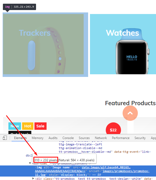 - multiply by two width and height. You get the recommended image size for you configuration. For example image it's 620 x 464 pixels - why to multiply by two? It's for devices with retina screens. For our demo we use 584 x 438 pixels Recommended image format is PNG |
| 2 | Image hover animation |
Select image animation effect on hover. Available options: left > right - move image from left to right right > left - move image from right to left bottom > top - move image from bottom to top top > bottom - move image from top to bottom zoom in - zoom in image none - disable hover effect |
| 3 | URL | Set banner URL |
| 4 | Line 1 (text) | Set banner text |
| 5 | Text position | Set banner text position |
| 6 | Line 2, Part 1(text) | Set second line of text. Used on hover. |
| 7 | Line 2, Part 2(text) | Set second line of text. Used on hover. You can highlight part of second line text. |
| 8 | Hover text position | Set hover text position |
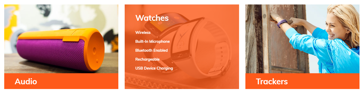
4 banners
Use this section to manage advanced banners block, with wide and high banners.
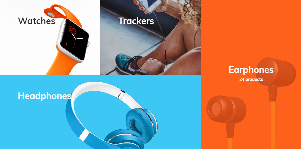
This section is basically the same as previous. I will describe here only differences.
Please review banners section before continue on this one.
Differences with banners section
| # | Name | Description |
| 1 | Layout options: width, margin, padding | Is not available for 4 banners section. It always full width with 0 margins and 0 paddings. |
| 2 | Block banner |
Number of blocks is limited to 4. Block position is very important. Cause third banner will be scaled to landscape size (wide). Forth banner will be scaled to portrait size (tall). 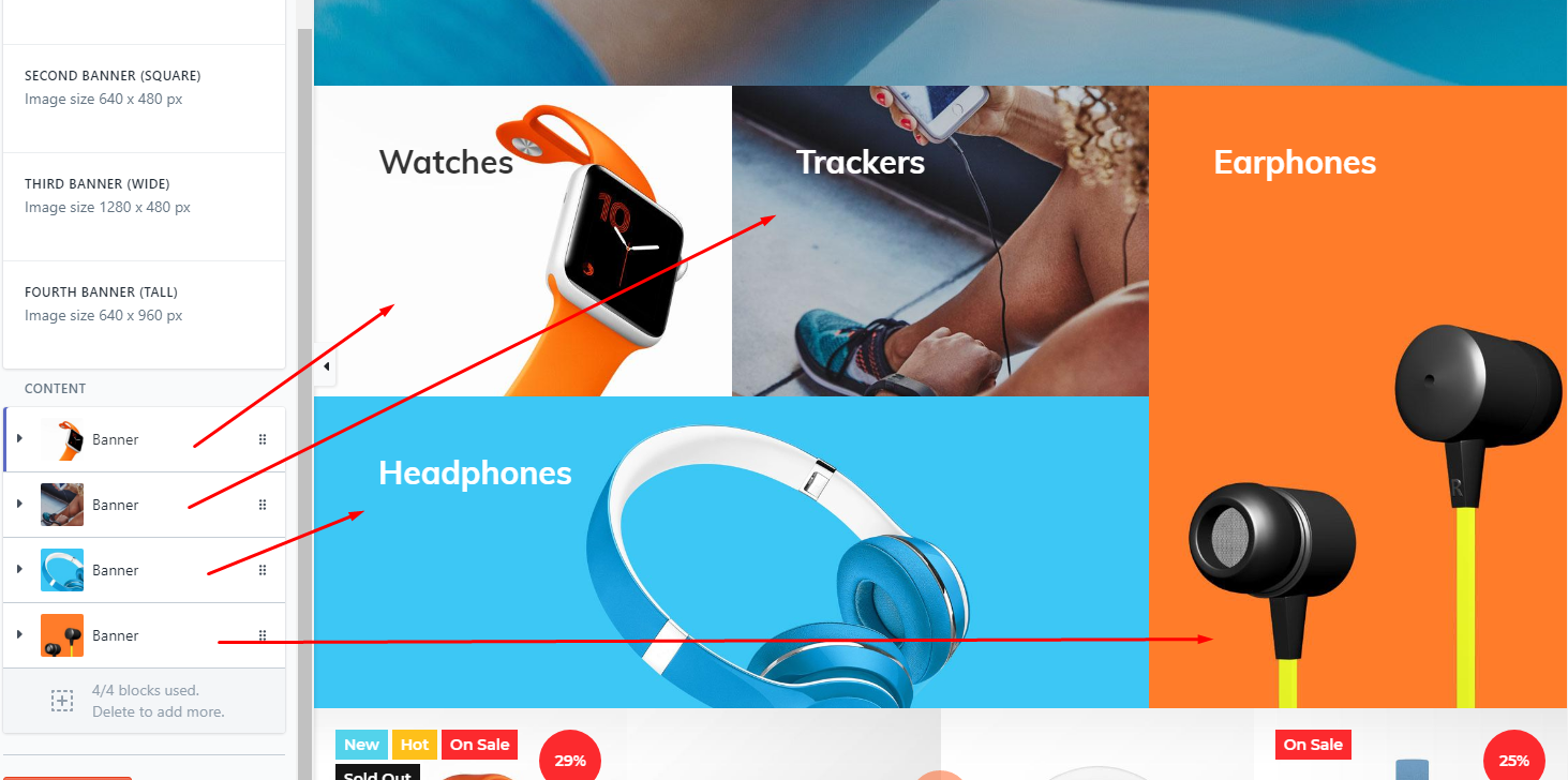
Recommended image size: 640 x 480 px - for first and second block 1280 x 480 px - for third block 640 x 960 px - for fourth block |
Banners with list
Use this section to manage banners at home page, with link list on hover.
This section is basically the same as banners. I will describe here only differences.
Please review banners section before continue on this one.
Differences with banners section
| # | Name | Description |
| 1 | Block banner: text line#1 text line#2 text position text hover position |
These settings are not available for banner list block. |
| 2 |
Block banner: list |
New option for banner list section. It shows the link list on hover. Configure link list at Store admin -> Online Store -> Navigation and set to this block option. |
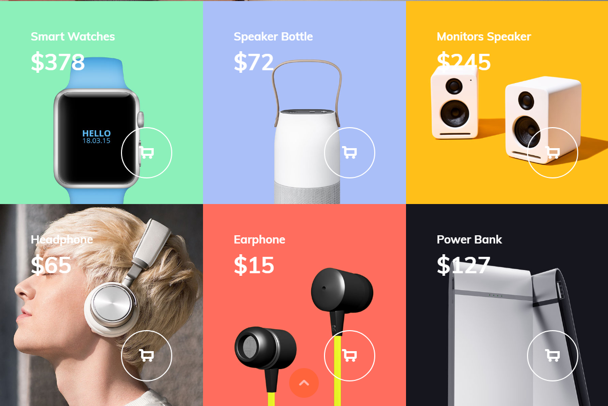
Product banners
Use this section to manage banners at home page, with products data: name, price, buy now button.
This section is basically the same as banners. I will describe here only differences.
Please review banners section before continue on this one.
Differences with banners section
| # | Name | Description |
| 1 | Block banner: text line#1 text line#2 text position text hover position |
These settings are not available for banner list block. |
| 2 |
Block banner: product |
New option for banner product section. It shows the product info on banner. Product name, description, price and add to cart button.
You should add products to your store first. Please refer to Shopify's user manuals how to manage products. |
Before you start working with products home page sections. Be sure that you are familiar with products and collections management at Shopify
For advanced product configuration. Refer to theme settings and MogoPlus app sections of this documentation
One product banner
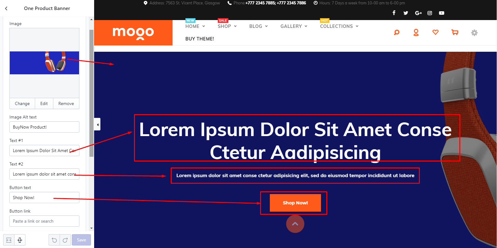
Section options
| # | Name | Description |
| 1 | Image | Set product image. Recommended image size is 1920 x 640 px |
| 2 | Image Alt text | Set image alt text |
| 3 | Text #1 | Set text #1 |
| 4 | Text #2 | Set text #2 |
| 5 | Button text | Set button text |
| 6 | Button link | Set button link |
| 7 | Width | Select section width. Full width or boxed. |
| 8 | Margin | Set margin. Without margin, margin like on demo#7, custom margin |
| 9 | Custom Margin |
This is pure CSS field. You can put any valid CSS value here. Get more info here |
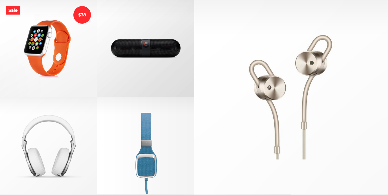
Products (4 plus 1)
Section options
| # | Name | Description |
| 1 | Layout type | Select layout type. Big product at left or at right. |
| 2 | Big product | Select product. |
| 3 | Small product (top, left) | Select product. |
| 4 | Small product (top, right) | Select product. |
| 5 | Small product (bottom, left) | Select product. |
| 6 | Small product (bottom, rigth) | Select product. |
Products (collection)
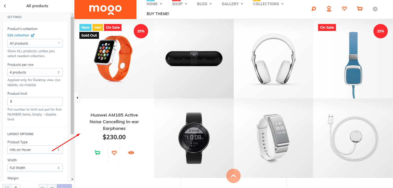
Section options
| # | Name | Description |
| 1 | Product's collection |
Group products into collection. Select which collection you want to show on this section. |
| 2 | Products per row | Set products per row opton. |
| 3 | Product limit | Set products limit. You can show limited number of products. |
| 4 | Product Type |
Select product layout. Info on Hover - show product info on hover. Info under product image - show product info under the image. |
| 5 | Width | Set section width |
| 6 | Margin | Set section margin |
| 7 | Custom Margin |
This is pure CSS field. You can put any valid CSS value here. Get more info here |
Products slider
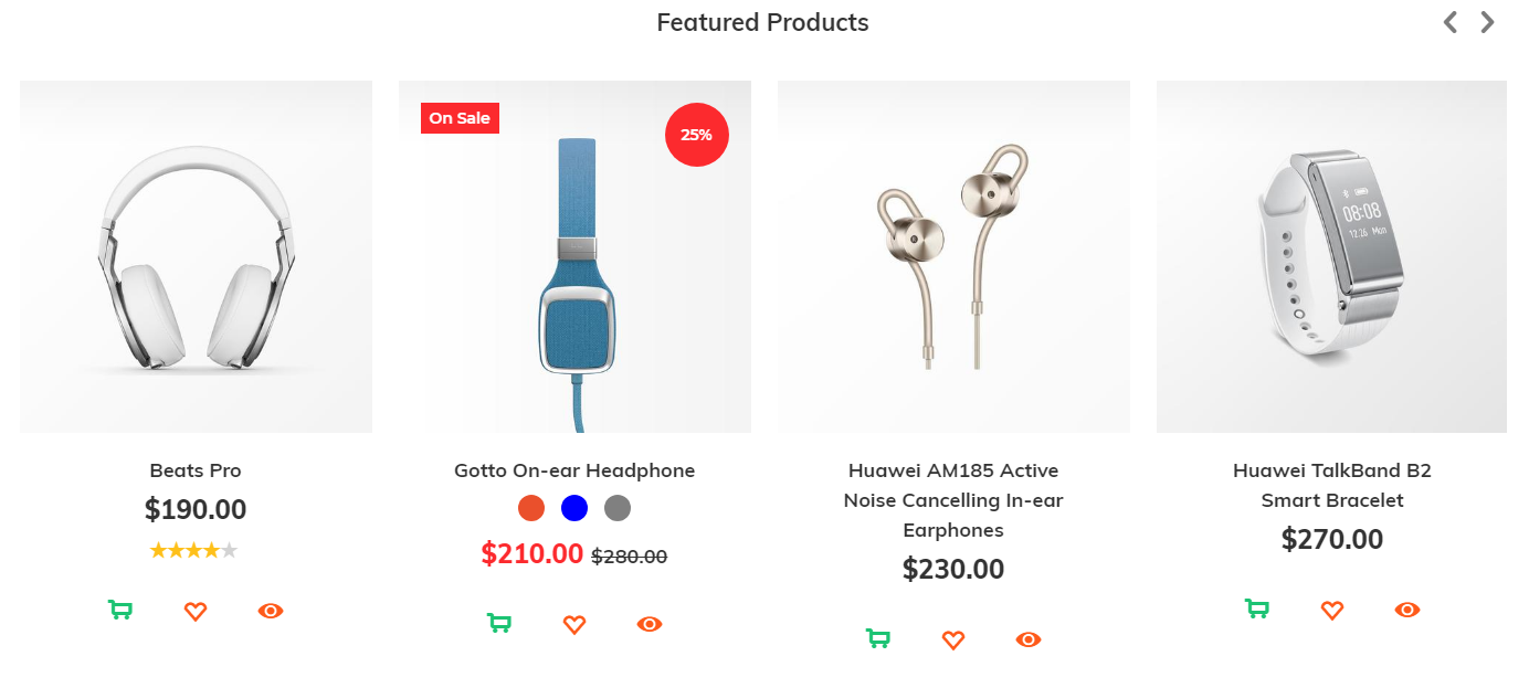
Section options
| # | Name | Description |
| 1 | Product's collection | Select product collection to show in slider |
| 2 | Product limit | Set product limit. To show only first X products. |
Products vertical sliders
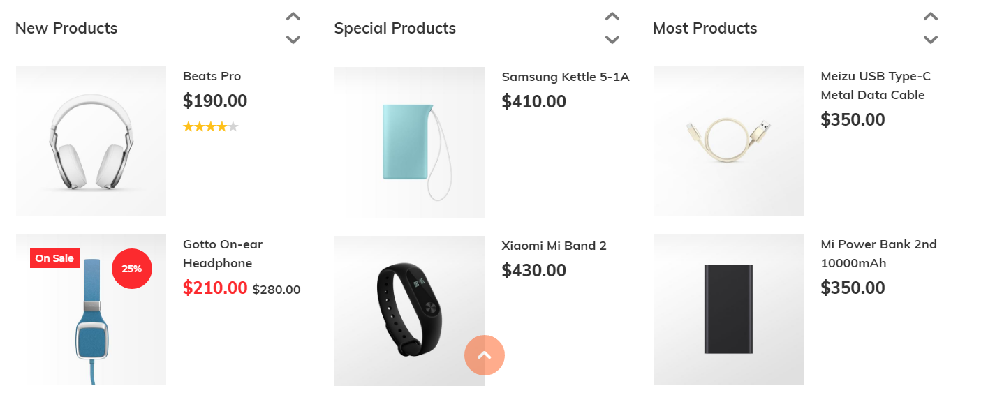
Section options
| # | Name | Description |
| 1 | Product's collection #1 | Set collection for first vertical slider. |
| 2 | Product's collection #2 | Set collection for second vertical slider. |
| 3 | Product's collection #3 | Set collection for third vertical slider. |
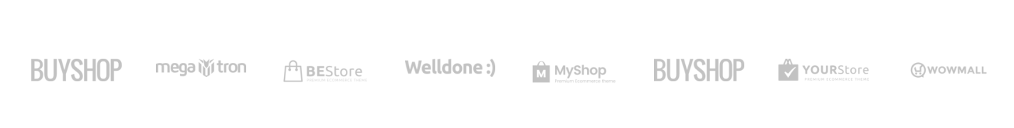
Brand slider
Add this section to show brand slider at home page
Section options
| # | Name | Description |
| 1 | Width | Set section width. Full screen or boxed. |
| 2 | Margin | Set section margin |
| 3 | Custom Margin |
This is pure CSS field. You can put any valid CSS value here. Get more info here |
| 4 | Block: brand | Add as many brands as you need. |
Brand block options
| # | Name | Description |
| 1 | URL | Set brands URL |
| 2 | Image | Set brands image. Recommended image size 152 x 49 px |
| 3 | Image Alt | Set image alt attribute. Good for SEO. |
From the blog
Use this section to show latest posts from you blog.
You should be familiar with blog, articles management at Shopify software. If not, please refer to Shopify's documentation.
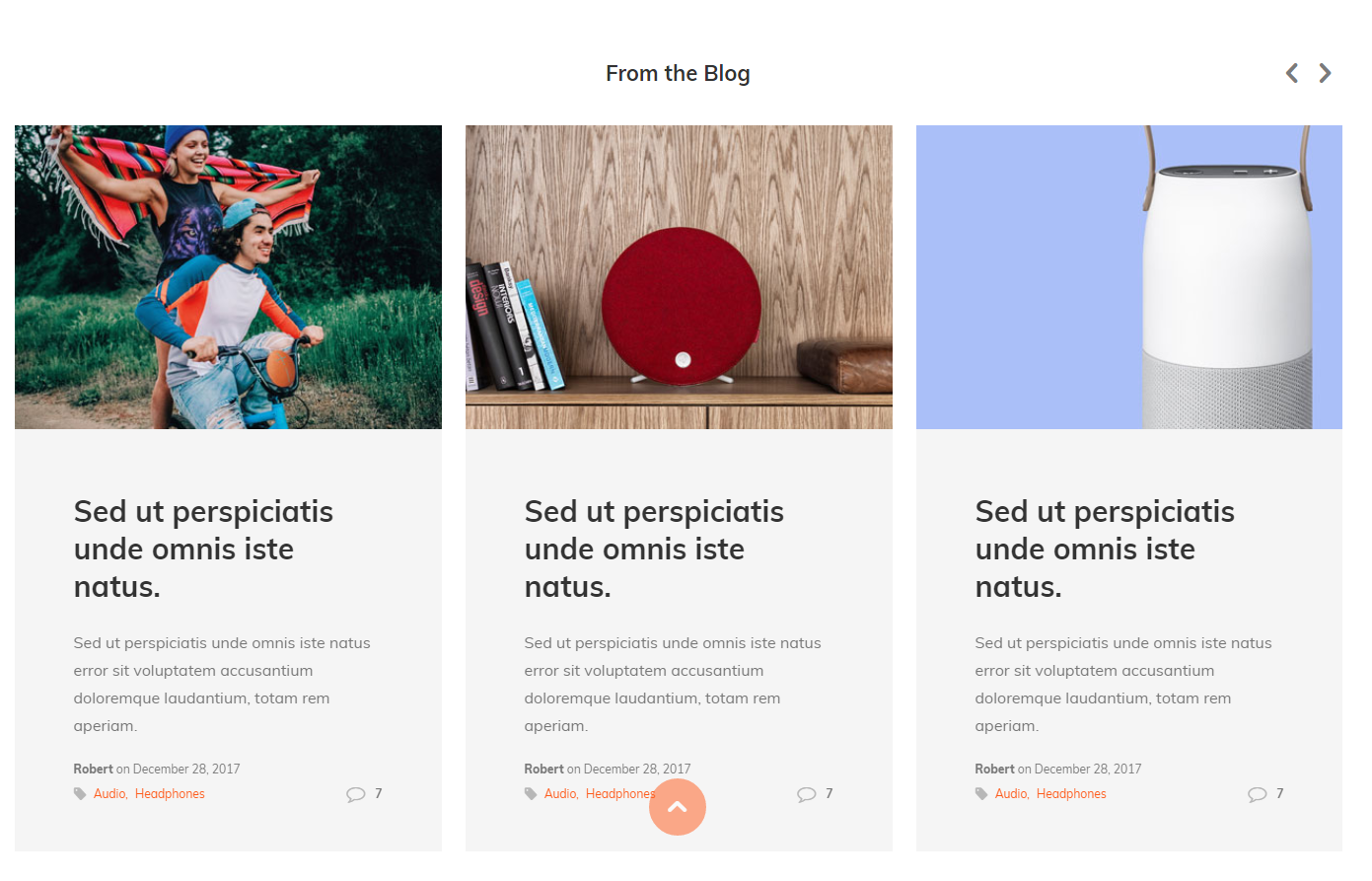
Section options
| # | Name | Description |
| 1 | Caption | Set section caption. Empty to remove caption. |
| 2 | Blog | Select blog. You should create blog and articles first. |
| 3 | Posts per row | Set number of post per row. |
| 4 | Number of posts | Limit total number of post in slider |
| 5 | Width | Set section width. Full screen or boxed. |
| 6 | Margin | Set section margin. |
| 7 | Custom Margin |
This is pure CSS field. You can put any valid CSS value here. Get more info here |
Infobox
Use this section to create info box at home page.
Section options
| # | Name | Description |
| 1 | Box Type |
Select type: Type #1
Type #2 
Type #3 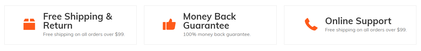
|
| 2 | Appearance | Set section width. |
| 3 | Block: banner | Add as many info boxes as you need. Recommended number from 2 to 4. |
Block options
| # | Name | Description |
| 1 | Icon code | Set icon. Empty to hide icon. Check all available icons here |
| 2 | URL | Set box URL |
| 3 | Text (line 1) | Set text #1 |
| 4 | Text (line 2) |
Set text #2. This is rich text editor input. You can format text with strong and You can also add link |
Instagram slider
Use this section to show latest post from your Instagram account
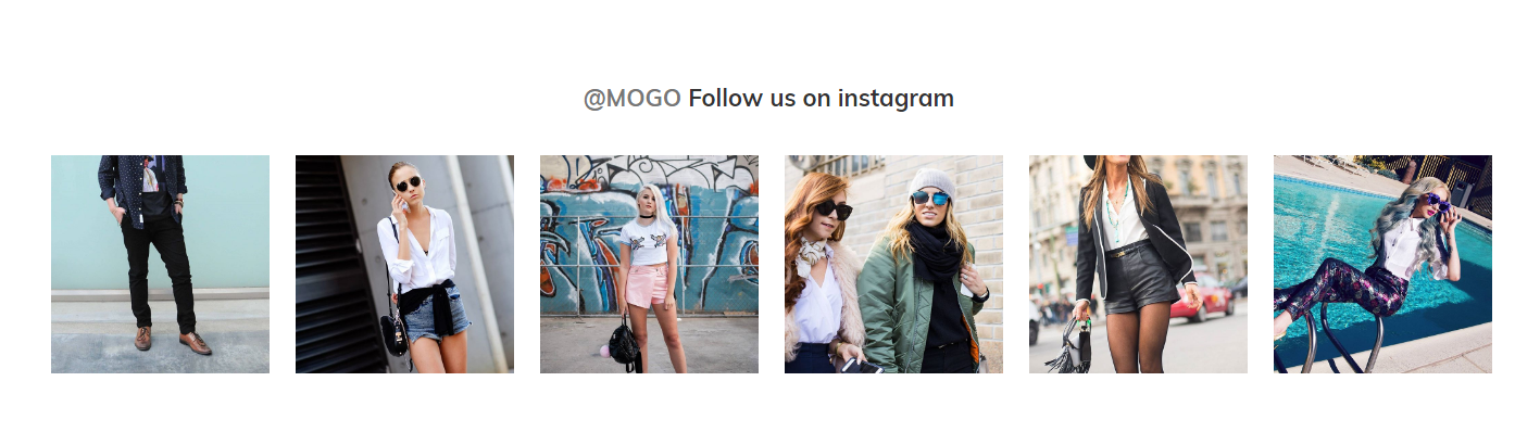
Options
| # | Name | Description |
| 1 | Caption link text | Set caption link text |
| 2 | Caption link URL | Set caption link URL |
| 3 | Caption | Set caption |
Instagram options
| # | Name | Description |
| 1 | Instagram user ID | Set Instagram user id |
| 2 | Instagram client ID | Set Instagram client id |
| 3 | Instagram access token | Set Instagram access token |
Looks like easy task, only three fields. But not :) It's not easy task.
You should directly follow next steps. Pay attention to every symbol, every whitespace, every detail.
When work with URL one wrong symbol may cause errors.
Steps to get Instagram user id, client id, access token
- You should have Instagram account, loaded with images. If not, create it right now. And load with images.
- Login to your Instagram account an sign up as new developer here
-
Register your application (client) here.
Most fields are not important you may fill it with random data.
The most important field is "Valid redirect URIs". Put there you website URL with ending slash "/". Example: "http://www.yourdomain.com/"
Client id will looks like b325d13ecb254c638a5f02c340911751
Note "Valid redirect URIs"
Note "CLIENT ID"
Go to your client configuration at Security tab and enable implicit OAuth (remove check on Disable implicit OAuth) -
Get access token
Copy example URL to your text editor (notepad for example)copyand replace [YOUR_CLIENT_ID] and [YOUR_REDIRECT_URL] placeholders with your data from previous step.https://www.instagram.com/oauth/authorize/?client_id=[YOUR_CLIENT_ID]&redirect_uri=[YOUR_REDIRECT_URL]&response_type=token&scope=public_content
you should get something like this
https://www.instagram.com/oauth/authorize/?client_id=b325d13ecb254c638a5f02c340911751&redirect_uri=http://www.yourdomain.com/&response_type=token&scope=public_content
Load this URL in browser
Press Authorize
You should be redirected to your website with added token in URL address bar.
Access token will looks like 233117080.b325d13.cc459df978e146f6961b2f3b48827c18
Note "access_token"
-
Get user ID
If you split access token by dots. You will get three strings. First string is your user id.
If access token is 233117080.b325d13.cc459df978e146f6961b2f3b48827c18
Here is you user id 233117080
You can also check user id as recommended here
Testimonials
Use this option to add testimonials block on home page
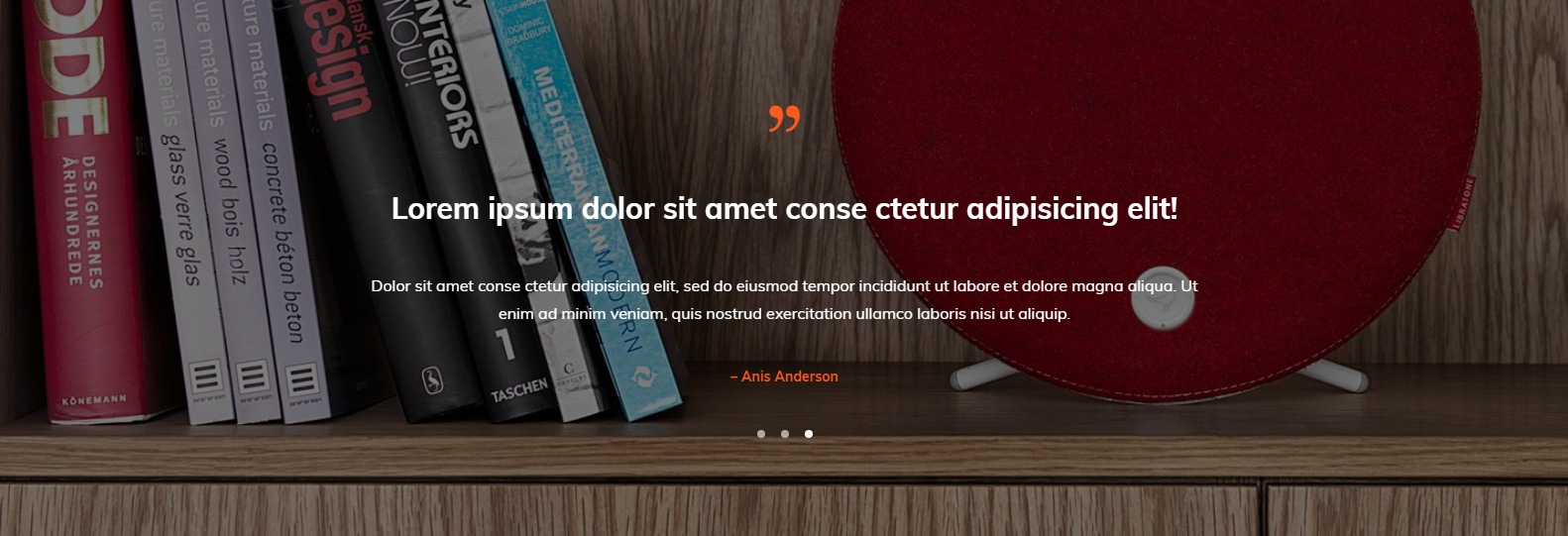
Section options
| # | Name | Description |
| 1 | Background image | Set background image |
| 2 | Image alt | Set alt text for background image. |
| 3 | Width | Set section width |
| 4 | Margin | Set section margin |
| 5 | Custom margin |
This is pure CSS field. You can put any valid CSS value here. Get more info here |
| 6 | Block testimonial | Add as many testimonials as you nee. |
Block testimonial options
| # | Name | Description |
| 1 | Caption | Set testimonial caption |
| 2 | Text | Set testimonial text |
| 3 | Author | Set testimonial author |