Installation
Video Manual
Logo
- Navigate to themes. Store admin -> Online Store -> Themes
- Go to theme customization mode. Press Customize button
- You should see home page at right and Sections tab at left sidebar. Select Header section.
- Upload image at Logo image field
- Save settings
Visible size is 130 x 39 px. Recommended size is twice bigger for better view on Retina displays and devices.
You can use custom logo size, we recommend to keep aspect ratio to 3.33 (260 / 78 = 3.33 )
Favicon
- Navigate to themes. Store admin -> Online Store -> Themes
- Go to theme customization mode. Press Customize button
- You should see home page at right and Sections tab at left sidebar. Select General settings tab.
- Find and select Favicon item.
- Upload image at Favicon image field
- Save settings
Recommended image format is PNG.
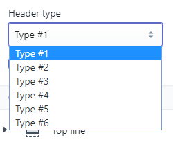
Header type
Theme includes six predefined header types. Each header type may include top line. Using combinations of header types and top line. You can get twelve different header layouts. You can review them on theme demo.
- Type #1
- Type #2
- Type #3
- Type #4
- Type #5
- Type #6
- Type #1 + top line
- Type #2 + top line
- Type #3 + top line
- Type #4 + top line
- Type #5 + top line
- Type #6 + top line
You can change header type at Header section.
.
Top line
To add top line add block Top line to Header section.
Edit block's settings to manage content.
You can change icon code. Check
all available icons.
Save empty field to remove element.
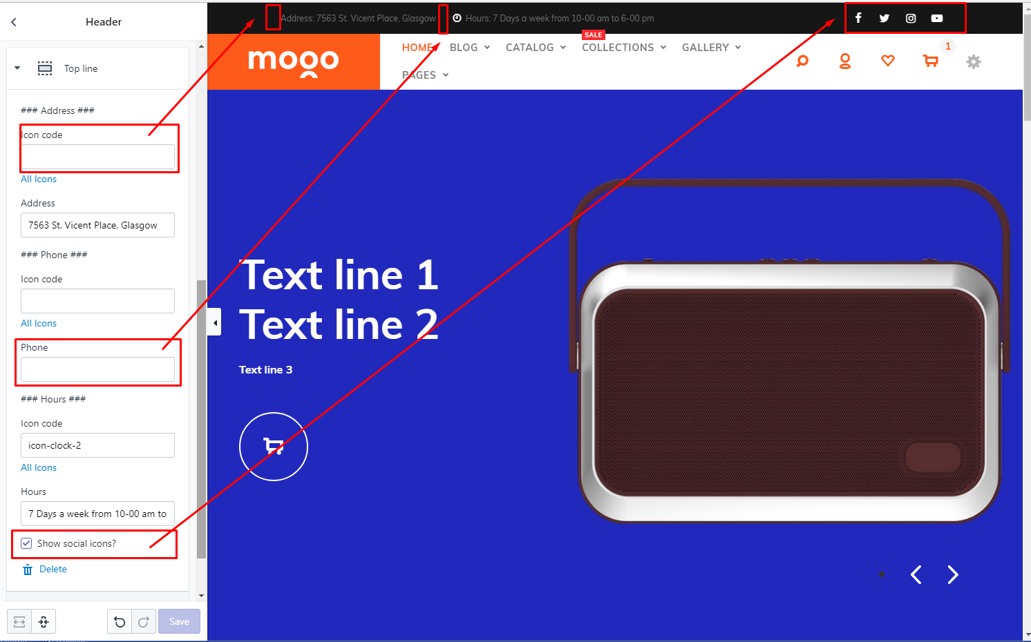
You can edit predefined captions "Hours:", "Phone:", "Address:" via Edit languages
Shopify feature.
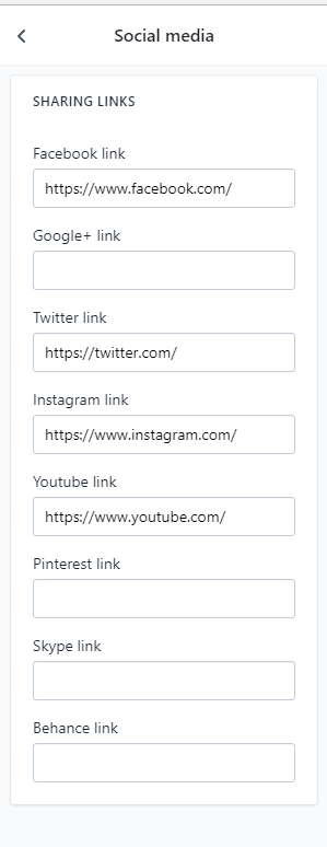
You can show or hide block with social icons. You can configure links for social icons at Customize theme -> General settings -> Social media
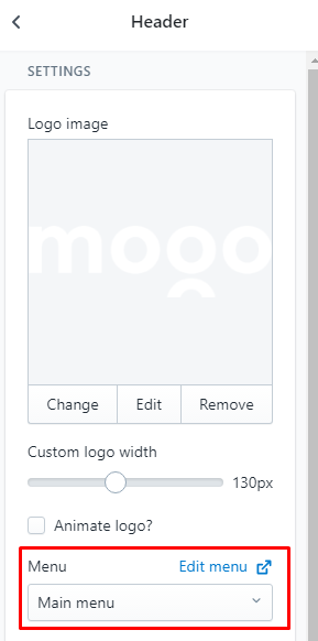
Header section. Full list of options
| # | Option | Description |
| 1 | Logo image | Upload your logo. |
| 2 | Custom logo width | Set logo width. |
| 3 | Animate logo? | Enable or Disable logo animation at page load. |
| 4 | Menu | Select menu for header main navigation. You should configure link list at Shopify backend first. |
| 5 | Header type | Select header type |
| 6 | Enable sticky header? | Enable/disable sticky header. When enabled you will see header even when scroll down to the page bottom. |
| 7 | Show login form? | Show login form at account popup. |
| 8 | Top line | Add top line content block to enable top line at header. To remove top line simple delete this block. |
Top line content block. Full list of options.
| # | Option | Description |
| 1 |
Address Phone Hours |
Icon code - set icon. Leave empty to hide icon. Check all available icons here
[Text field] - set text value. Leave empty to hide. |
| 2 | Show social icons? | If enabled it will show social icons, which is available at Global settings -> Social media. |
Configure simple navigation at header
- If you are not familiar with navigation at Shopify. Please check Menus and Links Shopify documentation
- Prepare navigation at Store admin -> Online store -> Navigation
- Go to Customize theme -> Sections -> Header
-
Set menu for header.
- Save
How to configure mega menu, advanced (10:10)
Configure mega menu drop down
- Be sure that you have completed previous step. And successfully configure Simple navigation
- Be sure that you successfully installed and activated MogoPlus app. Check Start here -> Install apps section of current documentation
- Go to Store admin -> Apps -> MogoPlus app
- Navigate to MegaMenu section
- Configure mega menu drop down options.
- Save
- Important! Apply changes to Store
Detailed description of mega menu drop down options
| Buttons | Description |
|
Add MegaMenu dropdown Save Update Edit Delete |
Manage mega menu drop down options in local app's database. These changes doesn't effect your store. |
|
Apply changes to Store Clear Store settings |
Sync app's database with your store. You can remove all mega menu options using "Clear Store settings" |
Detailed description of mega menu drop down options
| # | Option name | Description | Image |
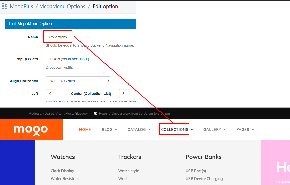
| 1 | Name |
Important! This is a key field. It should be equal first level menu item. |
|
| 2 | Color | Set color for first level menu item. |
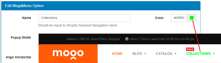
|
| 3 | Width |
Set width for mega menu drop down.
|
Menu width example 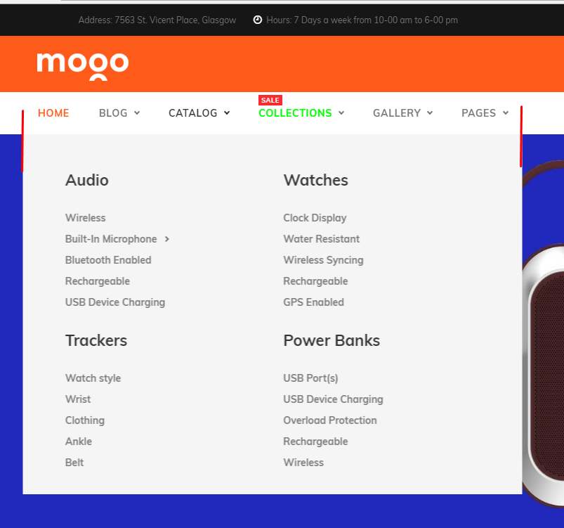
|
| 4 | Width in pixels (optional) | Integer. Number of pixels. |
Pixels example 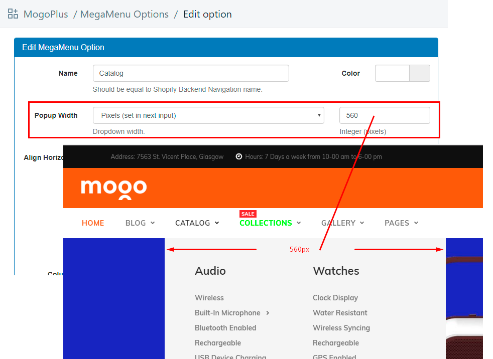
|
| 5 | Align Horizontal |
Configure drop down's horizontal align.
|
Item left example 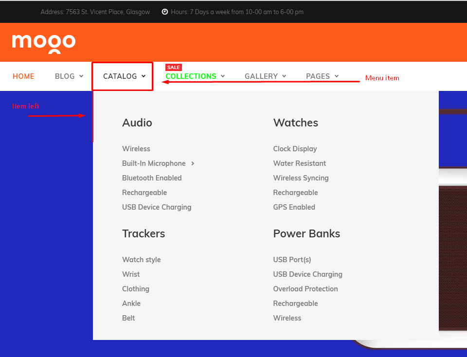
Item right example 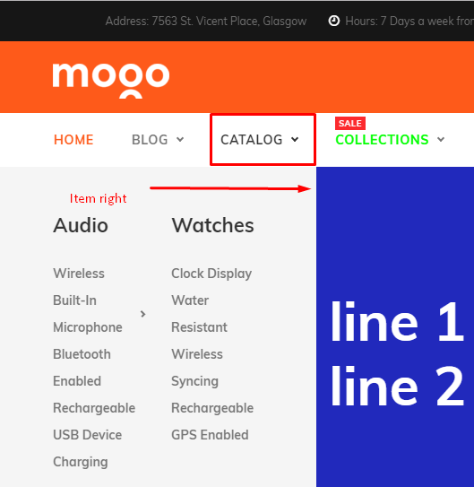
|
| 6 | Label | Set label for first level menu item |
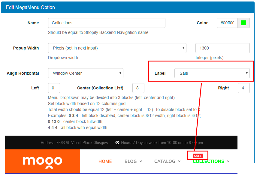
|
| 7 | Grid: Left, Center, Right |
Mega menu popup is divided into 12 equal columns Mega menu uses Bootstrap grid. Check more info about grid here. |
First example. 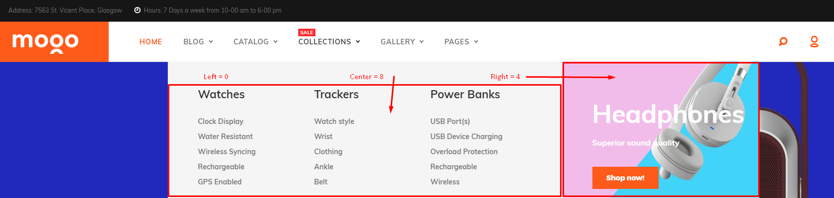
Third example. 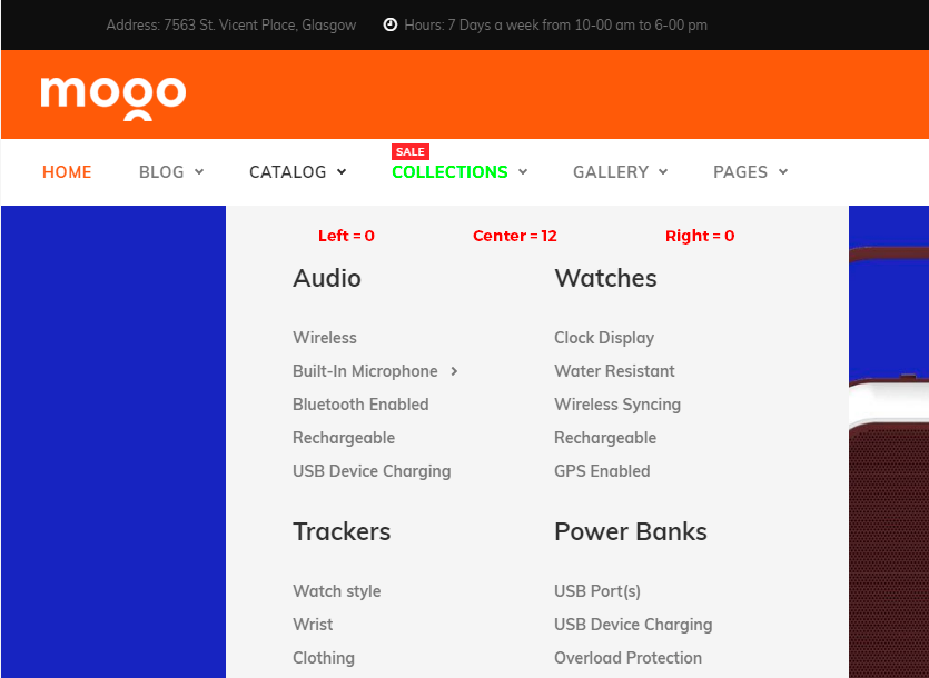
|
| 8 | Columns | Set the number of sublinks columns per row at center block. |
2 columns per row 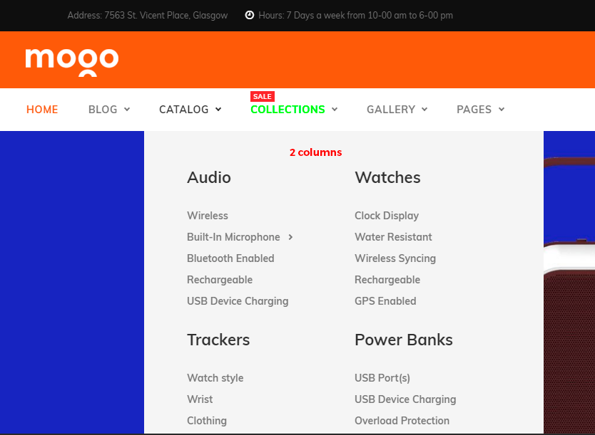
3 columns per row 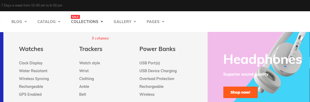
|
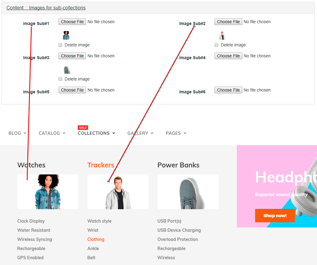
| 9 | Images for sub-collections: Image Sub#1, Image Sub#2, Image Sub#3, Image Sub#4, Image Sub#5, Image Sub#6 |
Set images at sublinks columns. Up to 6 images per drop down. |
|
| 10 | Custom content: Left, Right, Top, Bottom, Inner Top, Inner Bottom |
Each drop down has six placeholders for custom content. Please note.
Tinymce WYSIWYG editor - is not perfect tool for generating HTML code. I recommend to use it only for simple content with plain layout. And switch off WYSIWYG editor for more complicated layouts. You can use code from demo as example. If you are not familiar with WYSIWYG editor please refer to it's website here
copy
Insert image.
1) Upload image to your store at Store admin -> Settings -> Files 2) Copy image URL 
3) Paste image URL at WYSIWYG editor 4) Save 5) Apply changes to store |
Custom content placeholders.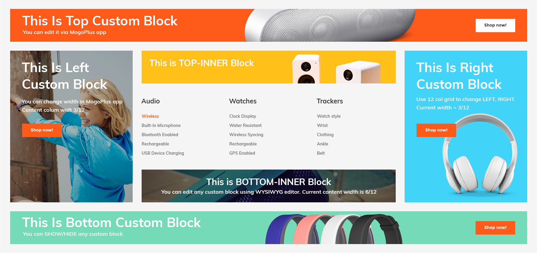
Insert banner template from demo 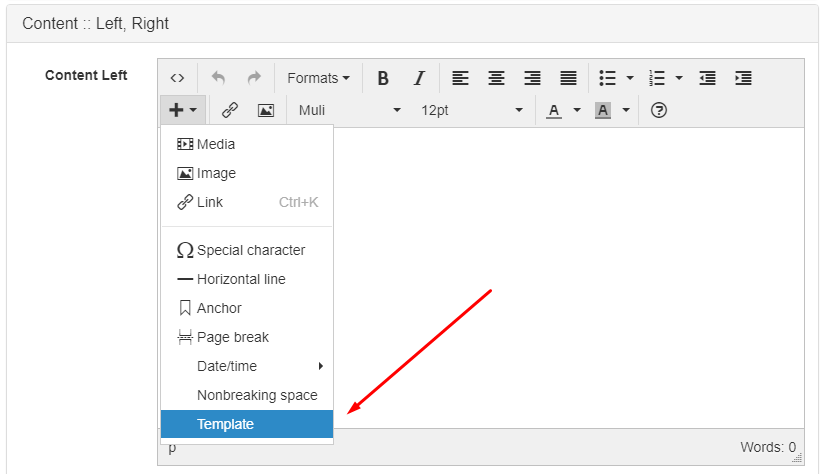
Edit content for right block 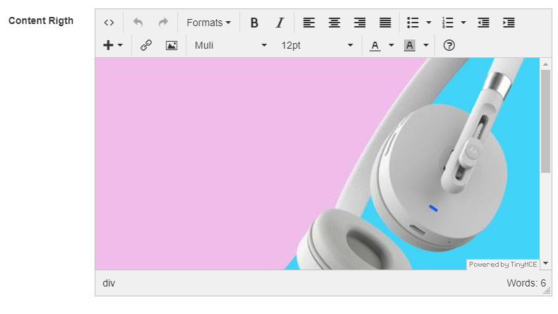
Edit raw HTML 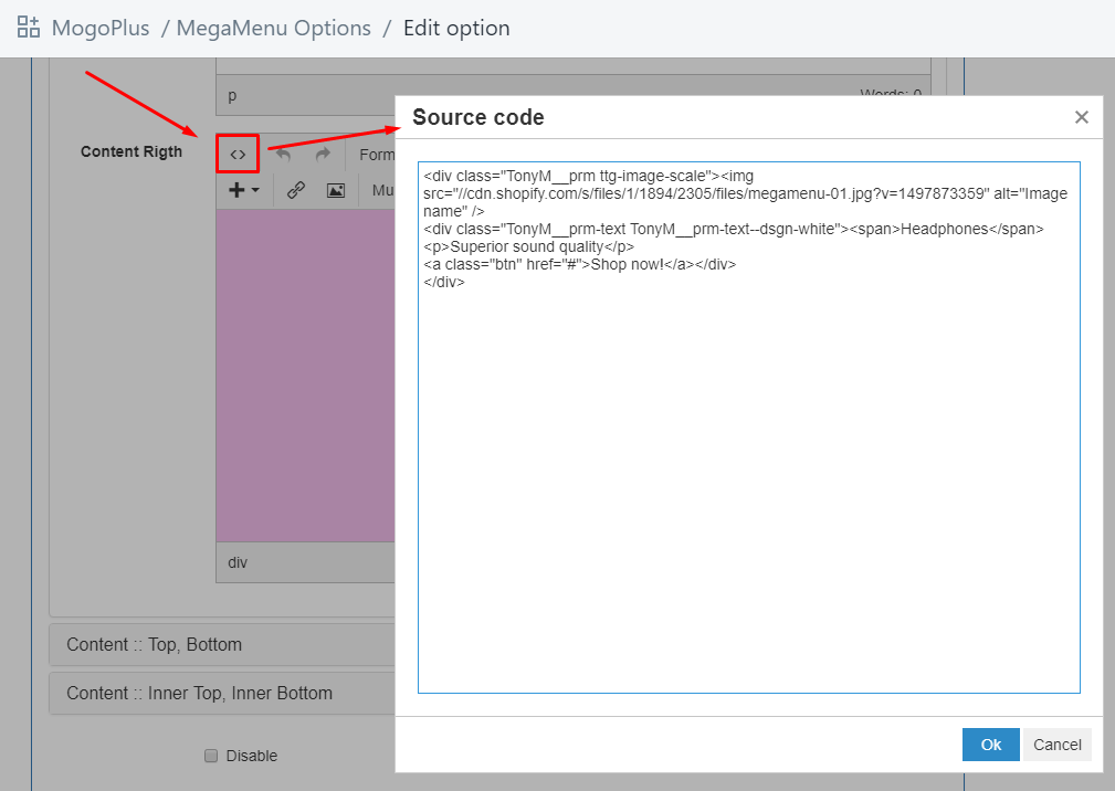
Edit image 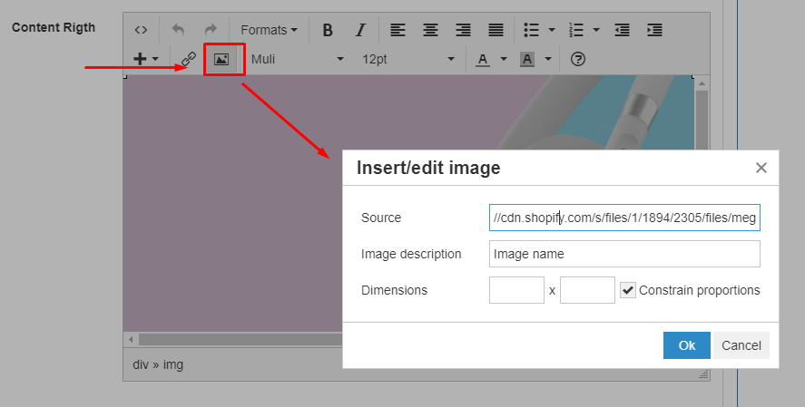
|
| 11 | Disable content padding | Hide paddings for content placeholders. | |
| 12 | Disable | Exclude this item from next sync with Shopify store. Use this option if you want temporary disable mega menu drop down. And don't delete it's configuration. Don't forget to Apply changes to Store. | |
Account popup
Enable accounts, video manualEnable accounts at Store Admin -> Settings -> Checkout
Currency switcher
Currency switcher, video manualSteps to add currency switcher
- Be sure you configure currency format at Store Admin -> Settings -> General. Check Start here -> Configure store section of current documentation for more details.
- Enable currency switcher at Customize theme -> General settings -> Currency
- Configure list of available currencies
- Set default currency
Language switcher
Language switcher, video manualYou should use third party app or run more stores. One store per each language.
Our theme include language switcher. It's basically list of links to new stores in particular language.
Steps to add currency switcher
- Create new stores per each language.
- Create link list with stores at Store admin -> Online Store -> Navigation
- Enable language switcher at Customize theme -> General settings -> Language
- Set default language
List of available translations.
| # | File | Language |
| 1 | locales/en.default.json | English |
| 2 | locales/fr.json | French |
| 3 | locales/es.json | Spanish |
| 4 | locales/de.json | German |
| 5 | locales/pt-PT.json | Portuguese (Portugal) |
| 6 | locales/pt-BR.json | Portuguese (Brasil) |
| 7 | locales/ar.json | Arabic. Don't forget to enable RTL option at layout settings. |